
resources
Presenting Data In A Meaningful Way – 6 Options How To Do It

Data visualization is an essential tool for making sense of data and communicating insights to others. It’s a powerful way to present complex information in an easy-to-understand manner, providing important context that can help inform decisions.
But with so many options available for visualizing data, it can be difficult to know where to start. From simple charts and graphs to more complex interactive tools and 3D models, there are numerous ways you can represent your data in meaningful ways.
Whether you’re looking for a basic solution or something more intricate, here are six options for presenting your data in a visually appealing format.
 Presenting Data In A Meaningful Way – 6 Options How To Do It
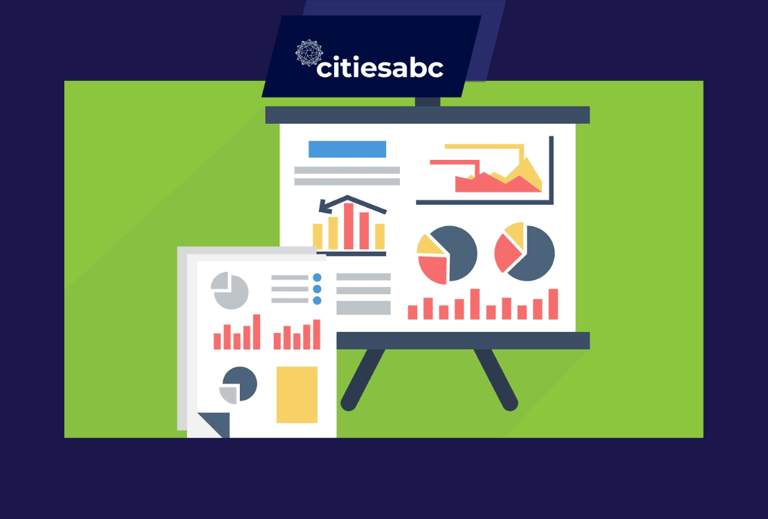
Charts and Graphs
Charts and graphs are an easy way to quickly compare data points, identify trends, and illustrate the relationships between different values. Common examples include pie charts, line graphs, bar charts, and scatter plots. They’re easily customizable so you can change colors and adjust the sizing to make the visuals more appealing.
Additionally, the ability to layer charts and graphs makes it possible to create complex visualizations that can help viewers spot patterns and gain insights. For instance, a line graph can be combined with a bar chart to show trends over time.
The Use of Real-time Experimental Data
Real-time data is a great way to create interactive and engaging visuals that capture the attention of your audience. With real-time experiments, viewers can interact with the visualizations, explore different views of the data, and gain deeper insights into the findings. Real-time data also makes it easier for viewers to spot new trends or changes in the data as it happens.
This software is especially useful for student data collection and analysis by making it easier to gather, organize, and visualize data in real time. Students and teachers can use different platforms, so this explanation about SPARKvue and Graphical Analysis 4, might be helpful. The capabilities, limitations, and best practices of each platform should be thoroughly reviewed before making a decision.
Maps
Using maps is another great way to present data in a meaningful way. Maps are particularly useful for illustrating geographic trends and patterns, as well as for visualizing data that has been collected from different locations. They can be combined with other visualization tools to give viewers an even more detailed understanding of the data.
For example, you can use heat maps to show population density or illustrate traffic intensity, while choropleth maps are useful for displaying data about election results or market segmentation. Maps can also be used to track the movement of people, goods, and services over time. If you’re looking for a way to convey data in an interesting and informative way, maps are worth considering.
3D Models
3D models can be used to create highly detailed visuals that are both engaging and informative. With 3D models, viewers can easily examine objects from all angles, allowing them to gain a better understanding of the data. This type of visualization is particularly useful for displaying complex data with multiple dimensions, such as medical or scientific data.
Creating 3D models can be a time-consuming process, so it’s important to plan and make sure you have the necessary resources available before embarking on a project. Additionally, 3D models require specialized software and training, so you may need to invest in some help if you’re new to this type of visualization.
Interactive Tools
Interactive tools allow viewers to explore and interact with data in a more engaging way. By using special software, viewers can manipulate the visuals and drill down into specific details, helping them gain insights that would be difficult to uncover with static images.
Common interactive tools include sliders, which allow viewers to adjust a value and see how it affects the data; pop-up boxes, which provide additional information when hovering over a certain element; and drill-down menus, which let you explore specific areas of the visualization in greater detail. Interactive visuals are great for conveying complex data and helping viewers better understand the findings.
Augmented Reality (AR)
Augmented reality (AR) is a relatively new technology that can be used to present data in a more immersive way. By combining visualization methods with sensory inputs such as sound, video, and haptics, AR helps viewers gain an even deeper understanding of the data.
For example, AR can be used to create 3D models in real time and visualize them from different angles. It can also be used to add annotations or text overlays that provide additional information about the data being presented. Although this technology is still in its early stages, it has huge potential for creating compelling visuals that help viewers better understand complex data.
 Presenting Data In A Meaningful Way – 6 Options How To Do It
No matter the type of data you’re trying to present, there are several options available that can help make it more meaningful and engaging. From maps and 3D models to interactive tools and augmented reality (AR), each method has its advantages and disadvantages, so be sure to do your research before deciding which one is right for you.
Ultimately, the goal should be to create visuals that enable viewers to gain insights from the data in a way that is both interesting and informative.
With these six options for presenting data in a meaningful way, you have all the tools necessary to achieve this goal.


